Contact Form

Name

Email *

Message *

Friday, November 26, 2010

Illustrations for LOOP mobile


This set of 3 illustrations were done for LOOP mobile. These were to be finally put up as hoardings so i had done details on each piece keeping that in mind. Since these were to get adopted in various sizes, i made these with lot of extra background which was then darkened in order to pop the headline. For some reasons the campaign got cancelled and now these images will never get released. So here i am sharing these with you all.
Sharing thumbnails-pencils-inks and few images showing details of the piece. I have cropped these in size of a wallpaper...so if you guys like any of these images, feel free to use it as you r wallpaper...click a snap of your desktop with you and mail it to me.

hope you guys like these.

Thursday, September 9, 2010

GQ assignemnts for Sept 2010


Stuff done for the month of september..need to up the game and do better stuff for these.

Friday, August 20, 2010

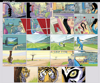
Storyboard for UZER KHAN


Hi this one was a mammoth board prepared to show the client directors version of their script. As always the agency script was very basic. Uzer wanted to present them a proper version of the same thing as to how he saw it happen in the film. Was real fun cracking the sequences one after another...This still has lot of loose ends.

The film finally never took off as the whole idea of cricket players being part of the show was abandoned...so the whole concept was tanked...Bad thing...
here it is for your viewing pleasure.

GQ assignments for AUG 2010


Regular bunch of stuff for the month of august...so wanted to work on the slim pants kicking the baggy pants somehow had loved totally the madness in that piece...but the editorial team felt it was very comic. Love that piece so here it is for you guys to see.

Monday, July 12, 2010

KICK ASS fun stuff


Reading kick-ass was totally fun.I love the book. I love the movie and i am waiting for the book 2.

Sunday, July 11, 2010

GQ Assignments for June + July


Hi all
I have been busy working some comic book projects and thus have not uploaded any new stuff on the blog lately. These were the active and groomign section illustrations i did for GQ. These appeared in the months of june and july. Did not take up sex talk and shrink for the same months as i was tied up with other projects...I will be uploading more from the current comic book projects mainly pages and all in some time. so stay tuned for more stuff.

Thursday, May 6, 2010

The Owl


THE OWL is a short story by Mr. Ratnakar Matkari. Its translated into english by Yogesh Chandekar for our ongoing short story festival on our FEAST website...This story will be uploaded in few days...I loved the mood and the backdrop against which the story is told...I just wish we adopt it for comic book format...would be super fun i am sure.

Here is the link to the website. You can catch the earlier short stories in the archive section. Enjoy and share with all your friends as well.
http://www.wix.com/thefeast/enter

GQ assignments for MAY 2010


Hi guys, stuff done for may GQ...new feature has been started that is ACTIVE...good for learning the right way to exercise...i am enjoying it for now. All the roughs and final pieces for you to check...Had loved the guy with a candy for style shrink, was rejected...but i liked the way the rough looks...MOBY was the model i was following for that piece...

Monday, April 5, 2010

Zoom in


These were done long time ago. This set of illustrations were done for JWT. Its for a booklet for nikon zoom lenses...Idea was to create a seamless zoom in kind of effect...so from a very wide shot of the city we are zooming in and the scene keeps changing as the sequence progresses...I enjoyed illustrating these. The effect is more evident if all these images play in a slide show format.

GQ Assignments for APRIL


These were pieces for GQ april issue.
Sex talk spoke about how there is no perfect 10 when it comes to sex...Good looks might not mean great sex...True...So i did like 3 roughs for it exploring various ideas. Shrink was very straightforward...So here are the roughs and final illustrations for you to see.
Starting from april i am doing few infographics for GQ...these are real fun to work on and sometimes very very challenging...Such was the case with the illustration for one of the article...basically it spoke about packing your suit butler style...I did some roughs but those were not what the art director wanted...Finally they suggested we go extremely simple and do it in one frame rather then doing multiple or two frames...
so this was it...
Check and leave your comments